Stoke-on-Trent is famously composed of six historic towns, Burslem, Fenton, Tunstall, Stoke-upon-Trent (often called Stoke Town), Longton and Hanley, each of which developed its own coat of arms or heraldic device in the 19th century. These arms reflect local industries (especially pottery), notable families and cultural heritage. Below, each town’s coat of arms is described in detail, including the meaning of every element, historical context (industry, geography and culture), the date of granting or adoption, and known designers. A final section explains the unified Stoke-on-Trent city coat of arms, created by merging symbols from the six towns after their federation.
Burslem
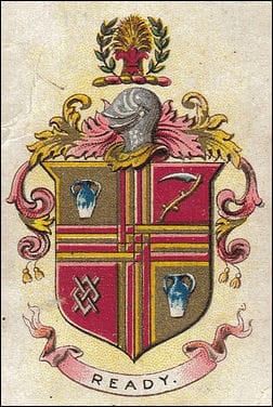
Granted: Burslem became a municipal borough in 1871 and was officially granted a coat of arms on 8 October 1878.
Notably, Burslem was the only one of the six towns to receive an official grant of arms before federation, earning it the nickname the “Mother Town” of the Potteries. The design was based on the device previously used by the Burslem Board of Health and was authorised by the College of Arms by letters patent.
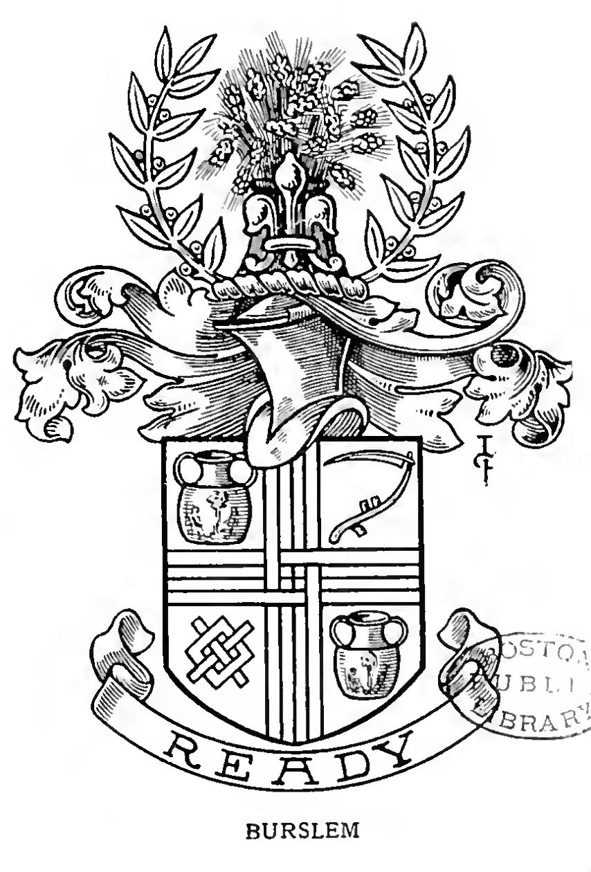
Shield: The shield is quartered gold and red with an interlaced fretty cross (two vertical and two horizontal strips interwoven) – a design element derived from the arms of the Audley family, an old Staffordshire noble family. Each quarter contains a distinct symbol:
- Portland Vase (First and Fourth Quarters): In the top left and bottom right quarters, a representation of the famous Portland Vase appears. This symbolises Burslem’s pottery industry and, specifically, the town’s association with Josiah Wedgwood. Wedgwood, one of Burslem’s most renowned potters, famously reproduced the ancient Portland Vase in ceramic form; its inclusion honours his legacy and the excellence of local ceramics.
- Scythe (Second Quarter): The top right quarter bears a scythe, taken from the arms of the Sneyd family. The Sneyds were prominent local landowners, and their emblem ties Burslem to its regional gentry heritage. (The scythe also appeared in Tunstall’s device, as the Sneyd family owned estates and influenced that area as well.)
- Silver Fret (Third Quarter): The bottom left quarter features a silver fret (a lattice or interlaced cross), also described as “a fret couped argent”. This too, comes from the Audley family arms and echoes the fretty pattern dividing the shield. It emphasises the historic influence of the Audley lineage in the region.
Crest: Atop the shield, Burslem’s crest consists of a golden garb (a sheaf of wheat) and a red fleur-de-lis, between two branches of laurel. The red fleur-de-lis was said to be the personal crest of Thomas Hulme, Burslem’s first mayor (1878). Its use pays tribute to him and perhaps symbolises purity or light. The wheat sheaf symbolises agriculture and plenty – reflecting that, despite Burslem’s industrial character, it was surrounded by farmland and owed some prosperity to the land’s yield. The laurel branches are classical symbols of honour and victory, suggesting pride in the town’s achievements. Together, the crest elements convey a message of prosperity (the garb), civic pride (laurels) and local leadership (the mayor’s fleur-de-lis).
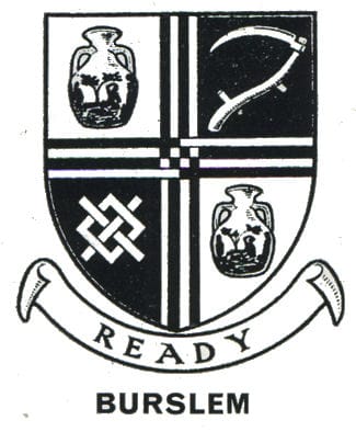
Motto: Burslem’s motto is “Ready”. This single word, displayed on a scroll beneath the shield, implies readiness for duty or progress. It captures the town’s forward-looking spirit during the industrial boom of the 19th century. Historically, Burslem prided itself on being enterprising and prepared to lead the Potteries, which this confident motto encapsulates.
Historical Context: Every element of Burslem’s arms reflects aspects of the town’s identity. Burslem was a cradle of the pottery industry – the Portland Vase and the motto “Ready” indicate Burslem’s pioneering readiness to transform local clay into art. Josiah Wedgwood’s connection highlights the town’s global influence on ceramics. The inclusion of symbols from prominent families (Sneyd and Audley) grounds the arms in local history and geography – the Sneyds and Audleys held land and power in Staffordshire, linking the town to the wider county’s heritage. Burslem’s status as “Mother of the Potteries” is reinforced by its being the sole town with officially sanctioned arms before the federation, underscoring its leadership role among the six towns.
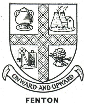
Fenton
Adopted: Fenton was unique among the six towns in that it never attained borough status before federation (it was governed by a Local Board and later an urban district), yet it adopted an unofficial coat of arms around 1840. The device was used by the town’s authorities even without an official grant (only Burslem had formal heraldic authority). The design’s creation likely involved local leaders – notably William Baker, the Chief Bailiff of Fenton in 1840, whose family arms inspired the crest.
Shield: Fenton’s shield is quartered by a gold-on-red fretty cross (a cross composed of interlaced strips). This crosshatch pattern is similar to the one found in Burslem’s arms (from the Audley family) and symbolises strength through unity (interwoven pieces). It divides the shield into four quarters, each depicting an aspect of Fenton’s economy and environment:
- Pottery Vase (Top Left): A ceramic vase is shown, representing Fenton’s share of the pottery industry. Pottery works in Fenton contributed to the area’s fame as “The Potteries”. The vase here is a generic symbol of ceramic production (distinct from Burslem’s specific Portland Vase) and signifies the craftsmanship of Fenton’s potters.
- Bottle Kilns (Top Right): Two iconic bottle-shaped pottery kilns appear in this quarter. These brick kilns were a prominent feature of Fenton’s landscape and essential for firing pottery. Their inclusion emphasises the town’s industrial skyline and the traditional methods of pottery manufacture.
- Pithead Wheel (Bottom Left): A mining pithead winding wheel is depicted, symbolising the coal mining industry. Fenton, like other Potteries towns, sat on rich coal seams that fuelled the kilns and provided employment. The pithead gear reflects the importance of coal mining to Fenton’s growth and the interdependence of mining and pottery (coal to fire the kilns).
- Sheaf of Corn and Plough (Bottom Right): A golden sheaf of corn in front of a plough represents agriculture. This motif acknowledges the agricultural land and rural heritage around Fenton. It reminds the reader that before and alongside industrialisation, the area’s fields produced grain. The plough and sheaf together stand for the cultivation of the earth, tying in with Fenton’s motto about progress – implying that from tilling the soil to firing clay, the town moves “onward and upward.”
Crest: The crest of Fenton is a goat passant (walking). This goat is taken from the arms of William Baker, who was the Chief Bailiff (principal official) of Fenton in 1840 and a prominent pottery manufacturer. The Baker family’s coat of arms featured goats (the Baker arms on Fenton Town Hall, for instance, show two goats on the shield). By using the goat, the town honoured William Baker’s leadership and contributions. In heraldry, goats can symbolise robustness and enterprise; here, it likely serves as a personal emblem connected to local governance and the founding of Fenton’s civic institutions.
Motto: Fenton’s motto is “Onward and Upward”. This English motto expresses optimism and progress. Chosen around 1840 during the early Victorian era, it reflects Fenton’s aspirations to develop and improve. The motto resonates with the imagery on the shield: the town sought to advance (“onward”) industrially (pottery kilns and mines) and improve its prosperity (“upward”) from agrarian roots (plough and sheaf) to industrial success. It encapsulates the spirit of ambition in a community transforming from a rural hamlet into an industrial town.
Historical Context: Fenton’s arms illustrate a town balancing old and new. In the mid-19th century, Fenton was less urbanised than the other towns – it was sometimes called the “forgotten town” – yet it rapidly grew with pottery factories and collieries. The inclusion of agricultural symbols alongside industrial ones shows Fenton’s transitional character: part rural village, part industrial hub. The fretty cross hints at shared heritage with the other Potteries (echoing Burslem’s design) and perhaps at the unity of the local industries. William Baker’s influence (the goat crest) is historically significant: his family not only led the town’s administration but also built Fenton’s Town Hall in 1888, symbolising civic pride. Thus, the coat of arms combined references to industry, agriculture and local leadership, aligning with Fenton’s 19th-century narrative of upward development.
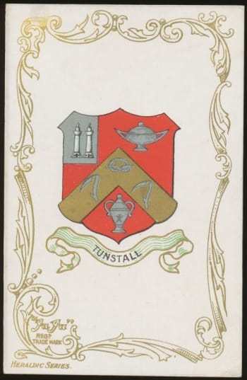
Tunstall
Adopted: Tunstall, the northernmost of the six towns, used an unofficial coat of arms (actually a seal device) from the 1860s. It never received an official grant – like Fenton, it was governed by a local board rather than a chartered borough, so it had no formal heraldic authority. The device likely originated with the formation of the Tunstall Burial Board in 1866, around which time a seal bearing these symbols was created. No specific motto was recorded for Tunstall.
Shield: Tunstall’s design consists of a shield featuring pottery imagery and a distinctive Staffordshire emblem:
- Chevronel with Stafford Knot and Scythes: Across the shield is a chevron-like shape (chevronel) charged with a Stafford knot and two scythes. The Stafford knot is a looped knot symbol traditionally associated with Staffordshire county; its presence proclaims Tunstall’s location and loyalty to the county. Tunstall was the only one of the six towns to include the Staffordshire knot in its arms. Flanking the knot are two scythes, borrowed from the Sneyd family arms. The Sneyd family were local landowners (residing at nearby Keele Hall and influencing North Staffordshire affairs), and using their scythe emblem tied Tunstall’s identity to that regional heritage – the same Sneyd scythe appears in Burslem’s arms as well. Scythes can also symbolise agriculture, but in this context, they are chiefly a heraldic nod to the Sneyds. Together, the knot and scythes on the chevronel signify Tunstall’s pride in being a Staffordshire town with gentry connections.
- Three Pottery Vases: There are three ceramic vases. These represent Tunstall’s pottery industry – the town was home to potworks and is part of the “Potteries” region. The number three might not have specific significance beyond design balance, but it reinforces the importance of pottery manufacture to the town’s livelihood. Each vase is a testament to the craftsmen of Tunstall producing earthenware and ceramics.
- Bottle Kilns (Upper Corner): In the upper left corner of the shield, there is a small depiction of two bottle ovens (kilns). These conical brick kilns were ubiquitous in the skylines of the Potteries towns, including Tunstall, where several potteries operated. Their inclusion makes the industrial landscape part of the arms and underlines the town’s identity as a centre of pottery production. The kilns, emitting smoke, would have been a daily sight and a source of employment and wealth.
(Tunstall’s device did not include a recorded crest or supporters in common use, being mainly used as a seal image. It also had no official motto.)
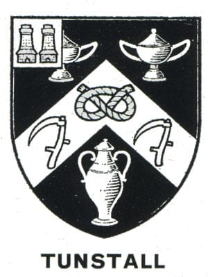
Historical Context: Tunstall’s arms highlight the town’s dual connection to industry and region. The Stafford knot shows civic pride in being part of Staffordshire. This is significant because, during the Victorian era, many towns used the knot to assert their county ties. For Tunstall, which became an Urban District rather than an independent borough, the knot perhaps compensated for its lack of a separate charter by emphasising the broader county identity. The Sneyd scythes acknowledge the influence of a local aristocratic family – Sneyd family members served in local roles (for example, Walter Sneyd was an MP for Staffordshire) – linking Tunstall to the area’s landed gentry. On the other hand, the vases and kilns are a frank depiction of the pottery trade that dominated Tunstall’s economy in the 19th century. Tunstall was known for manufacturing tiles and sanitaryware, and these symbols speak to that industrial heritage. In 1910, when the six towns federated, Tunstall’s use of the Stafford knot proved useful: the new city arms incorporated the knot from Tunstall’s arms to represent the whole area’s location in Staffordshire. Thus, Tunstall’s humble seal left a lasting mark on Stoke-on-Trent’s symbolism.
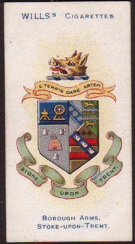
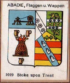
Stoke-upon-Trent (Stoke Town)
Granted/Adopted: The town of Stoke-upon-Trent (commonly called Stoke or Stoke Town to distinguish it from the city) became a borough in 1874. Upon incorporation, it adopted an elaborate coat of arms device, though, like most of the towns (except Burslem) it was never officially granted. The design was likely created around the time of Stoke’s charter, possibly under the guidance of the first mayor, Alderman W. M. Keary (elected 1874). The arms incorporated references to prominent local families and industries.
Motto: Stoke’s motto is “E terris dare Artem”, Latin for “To give art from the earth.” This phrase encapsulates the essence of Stoke’s pottery industry – transforming clay (earth) into beautiful ceramics (art). It reflects the town’s pride in the creative craft of potters who turned local raw materials into works of art. The adoption of a Latin motto also lends a sense of classical dignity to the arms, befitting a town that by the late 19th century saw itself as the civic centre of the Potteries.
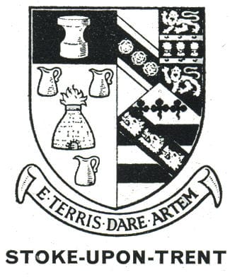
Shield: Stoke’s shield is a composite that pays homage to the town’s major pottery manufacturers and the craft itself:
- Potter’s Oven (Kiln) with Flames: At the centre of the shield is a traditional potter’s oven from which flames are issuing. This represents the bottle-kilns used in Stoke and the intense firing process of salt-glazed pottery. The flames specifically recall the early salt-glazing method (where pots were fired at high heat with salt thrown in, producing flames and vapour). This image highlights the technical aspect of Stoke’s chief industry and the literal “fire” that powered the town’s economy.
- Three Pottery Jugs: Around the oven (between its supports or in the shield design) are three pottery jugs. These finished vessels stand for the pottery products created in Stoke’s kilns. They signify the output of the industry – the utilitarian and art pottery for which Stoke-on-Trent was famous (Stoke Town itself was home to major potteries like Spode/Copeland and Minton). The number three likely provides symmetry and could also allude to the abundance and variety of Stoke’s pottery manufacturers.
- Potter’s Wheel: Above the oven, the shield depicts an early potter’s wheel. The wheel is one of the oldest tools of pottery and symbolises the craftsmanship and skill of the potter. By showing an “ancient” potter’s wheel, Stoke’s arms linked the town’s modern industry to the timeless human practice of pottery-making, underscoring continuity from antiquity to the present. It also complements the motto – art arising from the turning of the wheel and the clay of the earth.
- Incorporated Family Arms: The shield design also integrates elements from the coats of arms of four key figures/families in Stoke’s 19th-century history: the Copeland, Minton, Campbell and Keary families. These were influential names in Stoke:
- Copeland: A leading pottery dynasty (the Copelands owned the Spode pottery). From the Copeland arms, Stoke’s shield took two red bars on a gold field with three green trefoils above, and a band with three boars’ heads. In the composite arms, the most visible Copeland contribution is the boar’s heads motif (a symbol that later appears in the city arms). The Copeland boar’s head signifies the family’s role in Stoke’s industry and civic life – for example, Edmund and Robert Copeland were mayors and MPs.
- Minton: Another renowned pottery family (founders of Minton China). From the Minton arms came two horizontal ermine bars on a field, with three golden garbs (wheat sheaves) and two tigers. The sheaves of wheat in Minton’s arms likely signified prosperity and might nod to the family’s agricultural landholdings, whereas the tigers could have been crest supporters. Including Minton elements honoured Thomas Minton and his descendants, who established one of Stoke’s most successful potteries.
- Campbell: Colin Minton Campbell was a grandson of Thomas Minton and served as MP for North Staffordshire. He also had his own arms and crest. Stoke’s arms took a boar’s head crest from Campbell’s heraldry. (In the Stoke arms, the boar’s head actually serves as the crest on the helm, see below). This again underscores the influence of the Minton/Campbell family in local affairs.
- Keary: William Keary was Stoke’s first mayor. From Keary’s arms, the design borrowed three roses on a black fess (horizontal band). This element, representing Mayor Keary, was likely included on the shield (possibly to the left side of the oven, in some depictions). The roses symbolise beauty and perhaps the flourishing of Stoke under self-governance. By adding the mayor’s emblem, the arms paid tribute to those who led the borough’s founding.
The result was a complex shield where industrial imagery (oven, jugs, wheel) is combined with heraldic motifs of notable individuals. This fusion highlighted Stoke’s identity as both a community of craftsmen and a town guided by prominent civic leaders.
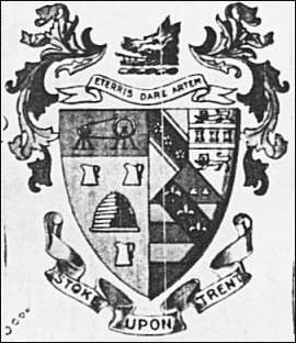
Crest: Stoke-upon-Trent’s crest (atop the helm of the arms) is a boar’s head. This silver boar’s head, erased (cut off cleanly at the neck), comes from the crest of the arms of Colin Minton Campbell, MP, as noted above. In heraldry, a boar’s head often signifies hospitality or courage (boars being fierce animals). In this context, it primarily serves to honour Campbell’s contributions. The boar’s head also visually complemented the other elements (for instance, the Copeland arms also contained boar’s heads, creating a thematic link). This crest would later find its way into the unified city arms to represent Stoke Town’s legacy.
(Stoke’s arms, as depicted in some sources, sometimes included artistic supporters like figures of a potter, etc., but officially, the description focuses on the shield, crest and motto.)
Historical Context: Stoke-upon-Trent (the town) considered itself the civic and ecclesiastical heart of the district – it housed the main parish church and, later the city’s town hall. Its arms reflect this self-image by being rich in symbolism. The motto “E terris dare Artem” speaks to the marriage of natural resources and human creativity – a nod to how Stoke’s pottery turned clay into art and utility. The prominent inclusion of local industrial pioneers (Minton, Copeland) in the arms is essentially the town’s “hall of fame”, indicating that Stoke’s identity was inseparable from these family enterprises. By incorporating their heraldry, Stoke was effectively saying that the town was built by these figures and their potteries. The presence of the potter’s oven, wheel and jugs makes the arms almost a pictorial story of the pottery process, which would have been instantly recognisable to residents. Furthermore, Stoke’s arms contributed a key element to the later city arms: the boar’s head (from the Copeland/Campbell line) was carried into the combined coat of arms of Stoke-on-Trent. Thus, Stoke Town’s heritage – its motto and its symbols of industry and leadership – became an integral part of the symbolism of the entire city.
Longton
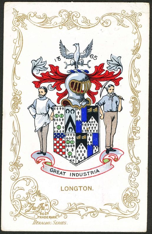
Adopted: Longton (originally the townships of Lane End and Longton) was incorporated as a municipal borough in 1865. The charter was granted on 3 April 1865, with James Glover serving as the first Mayor. The borough adopted a coat of arms device soon after incorporation, although, like its peers, it had no official grant. The design of Longton’s arms was steeped in local family heraldry, reflecting prominent figures connected to the town.
Motto: Longton’s motto is “Creat Industria”, which can be translated from Latin as “Let industry be made” or interpreted as “Let industry thrive”. This motto emphasises the importance of industriousness and manufacturing to Longton. It is essentially a call to industry – fitting for a town whose prosperity relied on pottery factories and coal mines. (The phrasing is a bit unusual in Latin; it might be intended in the spirit of Crescat Industria, meaning “Let industry grow”. In any case, the sentiment is the promotion of industry.)
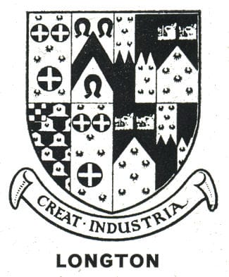
Shield: The shield of Longton’s arms is a quartered design that incorporates elements from the coats of arms of four interrelated families: Heathcote, Edensor, Gresley and Sandford. These families were connected by marriage and played significant roles in Longton’s local history. The choice to amalgamate their symbols created a coat of arms that is essentially a tribute to the lineage of Longton’s leading citizens in the 18th and 19th centuries, notably the family of Sir John Edensor Heathcote of Longton Hall and his relatives. The shield’s quarters are as follows:
- Heathcote: From the Heathcote arms, Longton’s shield takes three “pomeis vert” (green roundels) with a gold cross overall. In practical terms, imagine three green discs arranged (two above, one below) with a gold cross superimposed over them. Sir John Edensor Heathcote was a local industrialist, landowner of Longton Hall and High Sheriff of Staffordshire in 1784. By including part of his arms, Longton honoured the Heathcote family’s status and contributions. The green roundels could symbolise pellets or perhaps green apples (pomeis) – often a punning element since “Heathcote” does not clearly link to apples; they might simply be a decorative element of the Heathcote family arms. The gold cross signifies Christian faith or goodwill and was prominent in Heathcote’s heraldry.
- Edensor: From the Edensor family arms, the shield includes a black chevron between three black horseshoes. “Edensor” was actually Sir John Heathcote’s middle name and the maiden name of an ancestor; the Edensor family arms contributed the horseshoe motif. Horseshoes in heraldry can symbolise good fortune or horse breeding; in this context, they likely honour the family name. The chevron is a common heraldic device denoting protection or builders (it can symbolise a roof truss). The black chevron and horseshoes link to the Edensor lineage in Heathcote’s family tree and, thus, to Longton’s gentry.
- Gresley: The Gresley family arms contributed two elements: a field “vairé” of ermine and red and a “canton chequy”. Vairé is a fur pattern of alternating bell shapes (in this case in ermine, meaning white with black spots, and gules, meaning red), which creates a checker-like pattern across the quarter. A canton chequy is a small square in the upper corner with a checkered pattern. These come from the arms of the Gresley family (descendants of Sir Nigel Gresley) – Ann Gresley married Sir John Heathcote. The Gresleys were an old Derbyshire/Staffordshire family of note. The vair pattern and checkered canton add visual complexity and reference this noble connection. In heraldry, such patterns often indicate a family of high status. By featuring them, Longton’s arms acknowledge that through marriage, the Heathcotes were linked to the distinguished Gresley bloodline.
- Sandford: From the Sandford arms, Longton’s shield takes a blue field with an indented ermine pattern and two gold boar’s heads couped (cut off). Marianna Sandford married John Edensor Heathcote (the son of Sir John), bringing the Sandford family lineage into Longton’s story. The blue background with an “indented” ermine division (a jagged-edged white fur pattern) and the golden boar heads are straight from the Sandford coat of arms. Golden boar’s heads often symbolise hospitality and bravery; their presence here also foreshadows the boar’s head that will appear in the Stoke-on-Trent city arms (though in the city arms the boar’s head is officially linked to Stoke’s Copeland, Longton’s Sandford boars show the motif was part of Longton’s story too). Including Sandford’s device completed the heraldic representation of the Heathcote family’s alliances. Essentially, each quarter of Longton’s shield is a piece of the Heathcote family pedigree – a heraldic jigsaw of the families that, by blood or marriage, held sway in Longton.
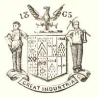
Crest: Longton’s crest is a silver (argent) eagle displayed (wings outspread). This eagle comes from the arms or crest of James Glover, Longton’s first Mayor. Glover was a local businessman who owned a brewery and a colliery (coal mine) in the area. The eagle was likely part of his personal or family heraldry and symbolises strength, courage and vision. By adopting Glover’s eagle, the town paid respect to its first mayor and his role in Longton’s commerce. An eagle “displayed” (with wings open) is a commanding symbol, perhaps also indicating Longton’s aspirations to soar industrially. This crest was later used in the unified city arms to represent Longton’s contribution – the black eagle in the city shield comes from this very symbol.
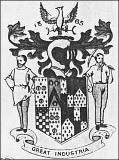
Supporters (unofficial): In some depictions, Longton’s arms are flanked by figures that personify its industries: a potter holding a vase on the left and a miner with a pickaxe on the right. While supporters were not officially granted, these figures appeared in local illustrations and emphasised Longton’s economic base. The potter represents the famous china and earthenware manufacturers of Longton (the town was known for porcelain – for example, Longton Hall porcelain in the 1750s and later firms like Aynsley). The miner represents the coal mining, which was vital in the area (Longton had several collieries). Together, they reinforce the motto “Creat Industria”, showcasing the town’s dedication to productive labour in both ceramics and mining.
Historical Context: Longton’s arms are a heraldic who’s who of the town’s ruling class and a statement of its industrial identity. The elaborate quartering celebrates the lineage of the Heathcote family, who were akin to local aristocracy – their country seat was at Longton Hall, and they were key figures in the 18th century.
By 1865, when the arms were adopted, invoking these ancestors (Heathcote, Gresley, Sandford) gave the new borough a sense of historical depth and legitimacy. It linked the industrial present to the genteel past. At the same time, the motto and the chosen crest bring the focus to industry and civic leadership in the present: “Let industry be made” clearly signals that the wealth of Longton lies in manufacturing, and James Glover’s eagle crest honours contemporary leadership and enterprise.
Longton, like other Potteries towns, was a centre of both pottery and coal – the two trades that shaped the community. The imagery of the potter and miner (even if unofficial) made that clear, as does the mix of symbols on the shield: one can interpret the horseshoes and boars as nods to a rural/agricultural past, but the motto and supporters drag the viewer into the industrial age. When Stoke-on-Trent’s city arms were created in 1912, Longton’s legacy was included via the eagle crest (for Glover) and the boar’s head symbol (interestingly, the city’s boar’s head was officially linked to Stoke’s Copeland, but Longton’s Sandford boars show the motif was part of Longton’s story too).
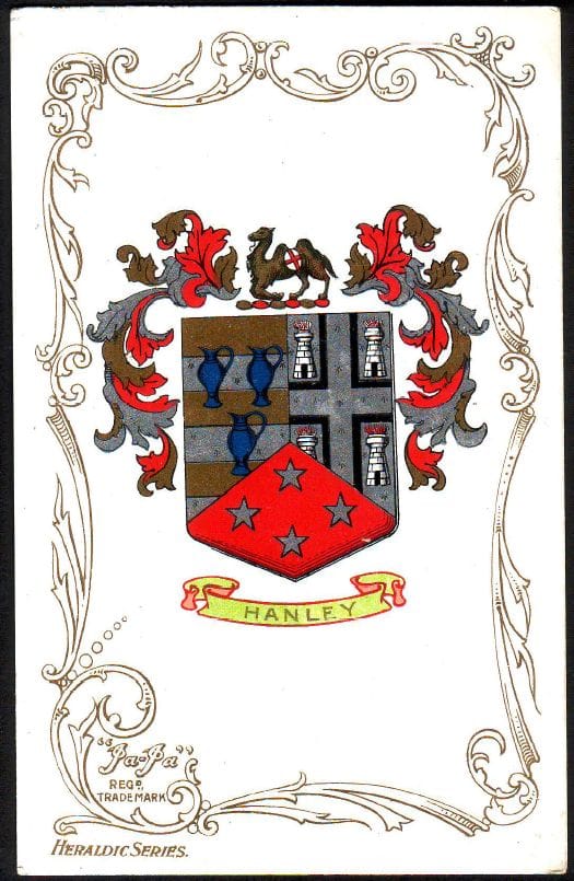
Hanley
Adopted: Hanley became a municipal borough in 1857, earlier than the other towns (it merged the townships of Hanley and Shelton and later included Etruria). That same year, in December 1857, a design for a corporate seal – effectively the borough arms – was produced by a Mr Robinson of Leamington. This designer’s work gave Hanley a complex device rich in local references. Hanley’s arms were used by the borough but were never officially granted by the College of Arms. (Hanley would later become the administrative centre of the federated Stoke-on-Trent.) Hanley’s device did not feature a formal motto.
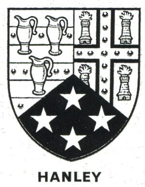
Shield: The Hanley shield is divided into three main panels (“quarterings”) representing the three wards or constituent areas of the borough in 1857: Hanley, Shelton and Etruria. Each section contains symbols reflecting that area’s history and industry:
- Hanley Ward (First Section): This portion shows six alternating bands of gold (yellow) and ermine (white with black spots), with three ewers (ceramic pitchers) positioned over the bands. The background of gold and ermine stripes is borrowed from the arms of the Bagnall family, who were the lords of the manor of Hanley in late medieval times. In the Bagnall coat of arms, a red rampant lion stood over similar gold/ermine bars. In Hanley’s adaptation, the lion was replaced by three silver/white ewer jugs to symbolise the pottery industry. The ewer (a type of pitcher) is a classic symbol of ceramic production – it indicates that Hanley was a centre of pottery manufacture. The number three could reflect the three towns that initially made up the borough or simply be heraldically balanced.
- Shelton Ward (Second Section): This part of the shield is derived from the arms of the poet Elijah Fenton, who was born at Shelton Old Hall in the 1680s. The original Fenton arms featured a cross ermine between four fleur-de-lis. In Hanley’s arms, these have been transformed: a cross (presumably red) is surrounded by four flaming furnaces. The furnaces (illustrated as small kilns or chimney-like figures with flames) represent the blast furnaces of the Shelton Iron & Steel Works. By the mid-19th century, Shelton (adjoining Hanley) was the site of heavy industry – iron smelting and later steel production – which was an important employer alongside the potteries. Replacing the fleur-de-lis with fiery furnaces cleverly ties a nod to a local literary figure (Elijah Fenton) with recognition of Shelton’s ironworks. It symbolises how Hanley Borough encompassed not just pottery but also the metallurgical industry. The use of a cross of ermine (a sign of dignity) from Fenton’s arms, encircled by industrial flames, can be seen as culture (poetry) meeting industry (iron) in Shelton.
- Etruria Ward (Bottom Section, Depicted as a Chevron): Etruria, a village founded by Josiah Wedgwood just outside Hanley, is represented by a chevron bearing four stars. The four stars (likely gold) come from the arms of the Wedgwood family. (The Wedgwood coat of arms includes a constellation of stars.) Josiah Wedgwood, the great potter, established the Etruria Works and village in the 1770s, which by 1857 was part of the Hanley borough. Including Wedgwood’s stars directly honours the founder of Etruria and the father of the local pottery industry. A chevron is often used in heraldry to symbolise building or roofing (literally, it represents a gable), and in this case, it may simply serve as the shape to contain the stars. The four stars can signify hope or guidance; here, they unmistakably point to Wedgwood’s pioneering role and Etruria’s contribution to the Potteries’ fame. Essentially, Hanley’s shield gave Wedgwood pride of place among its symbols, acknowledging that a portion of the borough (Etruria) was synonymous with his legacy.
Crest: Hanley’s crest above the shield is a camel carrying a cross of St. George on its back (a red cross on a silver shield). This unusual crest is the emblem of the Ridgway family. It was adopted in honour of John Ridgway, who became the first Mayor of the borough of Hanley in 1857. The Ridgways were prominent pottery manufacturers (the Ridgway pottery firm was well-known), and the family crest featured a dromedary camel carrying the flag (or shield) of St. George. The camel likely symbolises patience and perseverance; carrying the red cross of England might allude to far-reaching trade or a crusading spirit. By using Ridgway’s camel, Hanley’s arms paid tribute to its first mayor and one of its leading industrialists. This crest is distinctive – not many towns boast a camel – and it links Hanley’s identity to both local industry and national pride (through the St George’s cross). This camel crest was later lifted into the Stoke-on-Trent city arms as the emblem representing Hanley.
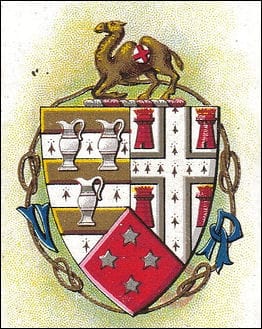
Surround (Ornamental Frame): Encircling the Hanley shield in some renderings is a cord tied in knots – specifically, a cord tied in four places with Stafford knots. This decorative border of knotted cord signifies two things: the four tied knots likely correspond to the four component areas (Hanley, Shelton, Etruria, and perhaps another locality) bound together as one borough; and the Stafford knots proclaim that Hanley is in Staffordshire. The Stafford knot was a common symbol used to adorn civic arms in the county. In Hanley’s case, the cord with knots literally “ties together” the shield’s three sections, a visual pun on unity within the borough and with the county.
(Hanley, like Tunstall, did not use official supporters or a motto. Its arms were usually shown with the crest and occasionally the knotted cord border.)
Historical Context: Hanley’s coat of arms is perhaps the most intricate of the six towns, reflecting its status as a burgeoning commercial centre and the largest of the Potteries towns by the late 19th century. Each element in the arms was carefully chosen to represent a facet of Hanley’s identity:
- Industrial Might: The pottery ewers for Hanley itself and the flaming furnaces for Shelton acknowledge the twin industries of ceramics and iron. This shows Hanley’s broad industrial base – it wasn’t just pottery; the Coal and Iron Company in Shelton was significant, and including it signalled that the borough’s prosperity rested on multiple pillars.
- Cultural and Historical Pride: By referencing the Bagnall family and Elijah Fenton, Hanley linked itself to local history and culture. The Bagnalls, as medieval lords, give a sense of continuity and legitimacy to Hanley’s existence, while Fenton (a renowned 18th-century poet who translated Homer) adds literary prestige. This combination suggests that Hanley saw itself not just as a workshop but also as a place of heritage and culture.
- Josiah Wedgwood’s Legacy: Perhaps most prominently, the nod to Wedgwood with the Etruria stars is a point of pride. Wedgwood’s decision to build Etruria brought global renown to the area. Hanley, including Wedgwood’s heraldry, is akin to putting a great inventor’s portrait on a city mural – it is an homage to the man who elevated the Potteries to international fame.
- Civic Leadership: The Ridgway camel crest highlights the importance of local leadership and philanthropy. John Ridgway was not only a mayor, but his company produced fine wares, and he was knighted later. The camel, an emblem of endurance, perhaps reflected the tenacity needed to lead a fast-growing town.
- Staffordshire Identity and Unity: The Stafford knots tied around the shield are a clear statement that although Hanley was rapidly industrialising and modernising, it remained proudly within Staffordshire and cherished the idea of unity (first uniting Hanley, Shelton and Etruria into one borough, and later being part of the union of the six towns). Indeed, when the six towns federated in 1910, Hanley was central to that movement. It is no surprise that in the unified Stoke-on-Trent arms, the camel (for Hanley) and the Stafford knots (from Tunstall, but also used in Hanley’s cord) appear as key elements.
Overall, Hanley’s arms mirror the town’s evolution: from a market village under the Bagnalls, to a Victorian industrial town of potteries and ironworks, to a civic centre led by industrialists like Ridgway. The lack of a motto did not detract from its message – the imagery was rich enough to tell Hanley’s story of “the useful and the beautiful”, industry and art, hand in hand.
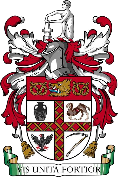
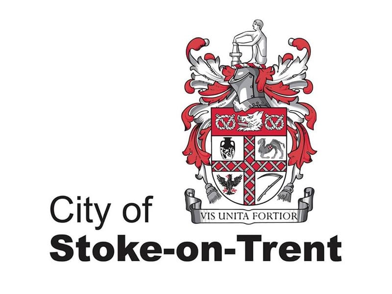
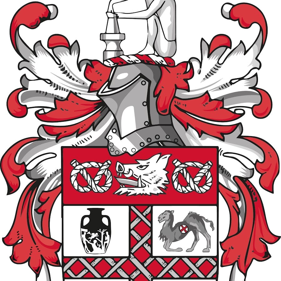
Stoke-on-Trent (Unified City Coat of Arms)
Creation of the Unified Arms: The six towns were federated on 31 March 1910 into a single county borough, officially named the City of Stoke-on-Trent. (Though called a “city”, formal city status would come later in 1925; 1910 marked the union under one council.) After the federation, a new coat of arms was needed to represent the amalgamated city. The unified Stoke-on-Trent coat of arms was duly designed by drawing symbols from each of the six constituent towns. It was officially granted by the College of Arms on 20 March 1912. The grant of arms meant the design received legal approval via Letters Patent. No single artist is credited in the records available, as the arms were likely devised in consultation between local civic leaders and the heralds of the College of Arms. Essentially, the new coat of arms merged elements from each town’s arms into one heraldic achievement. This composite approach ensured that all the towns’ identities were represented in the symbology of the City.
Description: The shield of the city’s arms is complex, and each element can be traced back to one of the six towns. In heraldic language: Argent, a cross gules fretty or, between in the first quarter a representation of the Portland Vase; in the second a camel kneeling proper, charged on the body with an escutcheon argent bearing a cross gules; in the third an eagle displayed sable; and in the fourth a scythe proper; on a chief gules a boar’s head erased between two Stafford knots or.
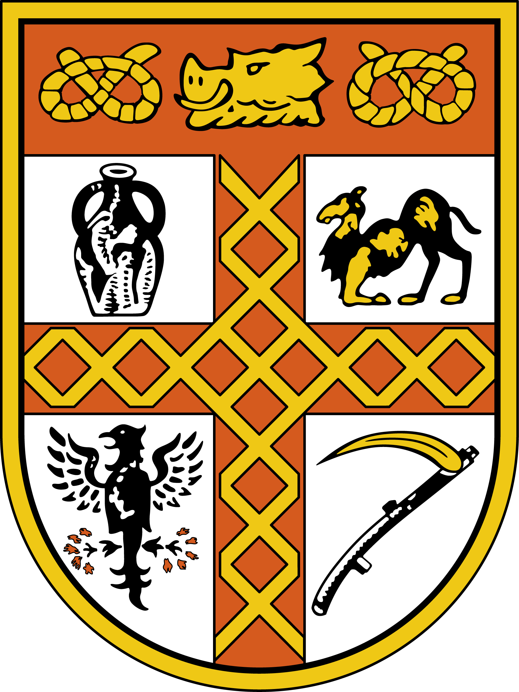
Crest: On a wreath of the colours, a potter of ancient Egypt at his wheel argent.
In simpler terms, the main features of the Stoke-on-Trent coat of arms (1912) are:
- Red and Gold Fretty Cross: Across the shield is a red cross interlaced with gold (a fretted or latticed cross). This was taken directly from Burslem’s arms, which had a cross of that pattern in gold and red (originating from the Audley family arms). The fretty cross not only represents Burslem’s contribution but also serves as a unifying device, literally “binding together” the quarters of the shield. Its gold-and-red colours and lattice design echo the rich heraldic design of the Mother Town and symbolically reinforce the idea of the six towns interwoven as one (a fitting motif for a united city).
- Portland Vase (First Quarter): In the upper left quarter of the shield is the image of the Portland Vase. This famous Greco-Roman vase, reproduced by Josiah Wedgwood, had appeared in Burslem’s arms and is carried into the city arms to represent Burslem and the pottery industry. The vase symbolises the artistry and classical inspiration of Stoke-on-Trent’s ceramic manufacture. It specifically honours the Wedgwood legacy and Burslem’s historical role; indeed, Burslem contributed two key symbols – the fretty cross and the vase – to the city arms. (In some interpretations, the vase is sometimes said to represent Fenton, since Fenton’s device also had a vase, but officially it is the Portland Vase, linking to Wedgwood and thus to Burslem’s heritage). Either way, it stands for the excellence of local pottery craftsmanship.
- Kneeling Camel with St. George Cross (Second Quarter): The upper right quarter shows a camel kneeling, bearing a small red St George’s cross on its back. This is drawn from Hanley’s arms – it is the crest of John Ridgway (the Hanley camel) transposed into the shield. The camel represents Hanley, symbolising the endurance and global reach of the Potteries’ trade (camels evoke far-off lands and long journeys, perhaps signifying the export of wares). The red cross it carries is the flag of England (St. George), indicating loyalty and perhaps Ridgway’s service to the nation. In the city arms, the camel is “kneeling proper”, meaning depicted naturally in a resting pose. Hanley’s unique camel emblem ensures that the town’s identity and its first mayor’s legacy are visible in the united shield.
- Black Eagle Displayed (Third Quarter): The lower left quarter features a black eagle with wings spread (displayed). This eagle comes from Longton’s arms – it is the silver eagle crest of James Glover, Longton’s first mayor, now shown in black (sable) for contrast on a silver field. The eagle stands for Longton, representing the soaring aspirations and industrial might of that town. Eagles in heraldry often denote courage, leadership and noble ambition, qualities attributed to Glover and Longton’s civic spirit. By including the eagle, the city arms acknowledge Longton’s contribution, especially in coal and pottery. (It also nicely balances the camel in the opposite quarter – a heraldic eagle versus a camel gives the shield an interesting menagerie reflecting the towns’ crests.)
- Scythe (Fourth Quarter): The lower right quarter contains a scythe. This symbol is taken from the arms of the Sneyd family and had featured in both Burslem and Tunstall arms. In the city coat, the scythe represents Tunstall in particular since Tunstall had used the Sneyd scythes in its device. The scythe here stands for Tunstall and, by extension, the agricultural past of some of the area (or simply the Sneyd influence in the northern towns). Notably, including the scythe gave Tunstall a clear presence in the city arms, despite Tunstall never having had an official coat of arms.
- Chief with Boar’s Head and Stafford Knots: The upper portion (chief) of the shield is red and contains a gold boar’s head in the centre, flanked by two Stafford knots, also gold. This component packs in multiple meanings:
- The boar’s head is taken from the arms of the Copeland family (and Colin Minton Campbell’s crest), which were used in Stoke-upon-Trent's arms. Thus, the boar’s head represents Stoke-upon-Trent. It honours the Copelands and the Stoke municipal borough’s heritage. Additionally, since Longton’s arms had boar’s heads via the Sandford family, one can say the boar’s head on the chief subtly nods to Longton’s history as well, but officially, it is attributed to Stoke’s contributions. The boar’s head symbolises strength and hospitality and ties the new city arms to Stoke Town’s legacy as the namesake of the city.
- The Stafford knots on either side of the boar’s head proclaim that the City of Stoke-on-Trent is in Staffordshire. These golden knots are directly drawn from Tunstall’s usage (Tunstall had the knot on its seal, and Hanley had knots in its decorative cord). By placing two Staffordshire knots prominently, the arms show pride in the county. The knots also have a secondary symbolism: Staffordshire’s motto is “the knot unites”, which resonates with the unification of the six towns – the knots literally “tie” the boar’s head to the chief, just as the federation tied the towns together. In the city arms, the knots were taken particularly from Tunstall’s device, giving Tunstall another spot in the heraldry (besides the scythe). They balance the chief design and make it clear that this is a Staffordshire city.
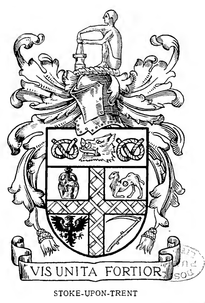
- Crest – Ancient Egyptian Potter: Atop the full arms is the crest: a potter of ancient Egypt at his potter’s wheel, working clay. He is typically depicted in silver (argent) garments. This Egyptian potter is a symbolic figure representing the antiquity and global significance of the pottery craft. Ancient Egypt was one of the earliest civilisations to develop advanced pottery, including the potter’s wheel, so this crest connects Stoke-on-Trent’s identity as the modern Potteries to the very origin of pottery in human history. It implies that the skills practised in Stoke-on-Trent have roots that are millennia old. The choice of an Egyptian potter also alludes to Josiah Wedgwood’s admiration for ancient pottery (Wedgwood was inspired by ancient Greek vases, one of which was the Portland Vase). In a way, the crest crowns the arms with a tribute to the craft that built the city, elevating the local industry to a timeless art. This crest did not come from any one town’s prior arms; rather, it was a new creation for the city, encapsulating the shared heritage of all six towns in pottery.
Motto: Below the shield is a scroll with the Latin motto “Vis Unita Fortior”. This translates to “United strength is stronger” (or “Strength united is more powerful”). The motto explicitly references the unification of the six towns: it asserts that by uniting, they have become mightier than they were separately. This phrase was chosen to inspire a sense of solidarity and combined purpose in the new city. It replaced the individual town mottos (such as Burslem’s “Ready” or Stoke’s “E terris dare Artem”) with a slogan that all could rally behind. “Vis Unita Fortior” succinctly conveys the whole rationale for the 1910 federation – that together, the towns could achieve more. It is a timeless motto for any union, and in Stoke-on-Trent’s case, it remains a proud reminder of the city’s origin.
How the Elements Reflect Stoke-on-Trent’s History: Each element in the city coat of arms is tied to the history and character of Stoke-on-Trent and its six parts:
- The fretty cross binding the shield recalls the shared heraldic theme from Burslem (Audley arms) and Fenton, symbolising how the different communities are now interlaced. It can also be seen as symbolising the lattice of canals and railways that linked the Potteries or simply the idea of strength through unity (lattices are stronger than single bars). Historically, by borrowing from Burslem’s granted arms, the city acknowledged Burslem’s senior status and the continuity of legal heraldry in the new arms.
- The Portland Vase stands for the pottery industry, which is the foundation of the city’s existence. It highlights Stoke-on-Trent’s reputation as a world centre of ceramics. Culturally, it ties to Josiah Wedgwood, one of the most important figures in the city’s history, whose work bridged classical art and industrial production. The fact that this symbol comes from Burslem’s arms but in some descriptions is said to represent Fenton’s contribution shows how interwoven the towns’ identities are when it comes to pottery – every town had potteries, but the vase honours the pinnacle of achievement in that field.
- The camel brings in the story of Hanley’s rise and the Ridgway family. It reflects the entrepreneurship of local pottery magnates and civic leaders. Additionally, a camel in the coat of arms of an English city is very distinctive – it hints at the far-flung commerce of Stoke-on-Trent (exporting pottery worldwide, even to the East, perhaps). Historically, it keeps alive the memory of Hanley’s first mayor and the fact that Hanley was once separate.
- The eagle signifies the bold spirit of Longton and commemorates its first mayor, James Glover. It also subtly alludes to coal – eagles were sometimes used in mining symbolism (for example, the “Phoenix” rising from flames akin to machinery rising from pits). More directly, it ensures Longton’s presence in the city arms and reflects that town’s independent pride pre-merger.
- The scythe anchors the arms in the region’s heritage via the Sneyd family and Tunstall. It reminds us that the area was not always industrial – there is an agrarian past and gentry estates that predate the Potteries. The Sneyd motto was “inspicuous et firma” (unseen yet firm) – one might poetically say the scythe in the city arms is “unseen” by many but a firm part of the design. It is a nod to the northern town of Tunstall and the fact that both Tunstall and Burslem respected the Sneyd influence. Historically, it also ties in that Ralph Sneyd was the first chairman of the federation of the six towns, thus, a Sneyd symbol is apt in the united arms.
- The Stafford knots explicitly place the city within Staffordshire. They tie the new city to the county’s history and identity. The knots had been used by Tunstall and Hanley, so they also represent those towns’ contributions. Importantly, they echo the motto’s theme: as a knot ties things together, so were the towns tied into one. Historically, the use of the county symbol signalled that even though Stoke-on-Trent became a county borough (administratively separate from Staffordshire), it still proudly identified with the county’s legacy.
- The boar’s head on the chief is a direct link to Stoke Town (and indirectly to Longton via Sandford), honouring the memory of leaders like the Copelands and Colin Minton Campbell in Stoke’s history, who were instrumental in local governance and industry. By extension, it symbolises the hospitality and bravery of the whole city. Historically, Stoke (the town) gave its name to the city, so it was fitting that a central element from Stoke’s arms (the boar) was placed at the top of the city shield.
- The Egyptian potter crest is a bold statement that Stoke-on-Trent sees itself as the heir to an ancient tradition. It elevates the city’s main trade – pottery – to an almost mythic level. In terms of local history, it does not come from any one town but rather from a collective identity: all six towns together are “The Potteries”, and this crest personifies that concept. It also reflects the educational and museum interest in the area; the Potteries Museum today holds ancient pottery, and even in 1912, there was awareness of pottery’s historical significance.
- The motto “Vis Unita Fortior” encapsulates the entire rationale and result of the 1910 federation. Historically, it proved true: the united borough of Stoke-on-Trent was able to achieve city status in 1925, have a Lord Mayor by 1928, and coordinate services (transport, utilities) much better than six separate towns could. The motto is a constant reminder that the six towns chose to unite to become a single powerful entity, a message that would resonate in civic speeches and documents.
The Stoke-on-Trent city coat of arms (granted 1912) is a heraldic mosaic of the six towns’ histories and symbols. Each emblem – the vase, camel, eagle, scythe, boar, knot and the potter – tells a part of the story of the Potteries. Together on one shield, they illustrate the city’s motto, “United strength is stronger”, showing that the identity of Stoke-on-Trent is the union of six proud communities, forged together much like clay in a kiln into something greater and enduring.
📍 Follow more of my adventures and discoveries here: https://linktr.ee/theredhairedstokie